
Makine
Client: Chevrolet - Makine
Role: UI/UX Designer
Year: 2018

Project Goals
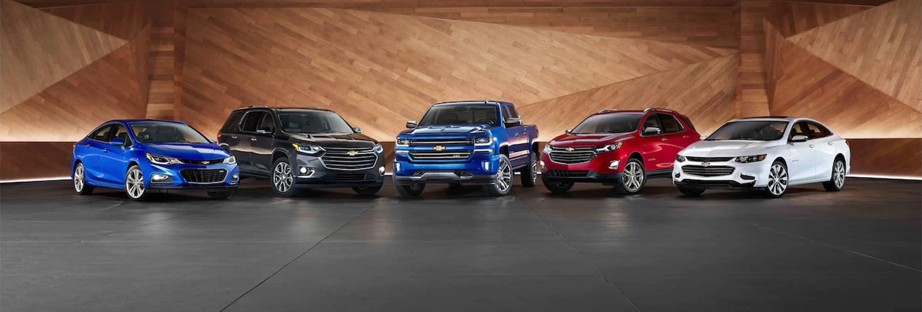
Design the interface of an e-commerce website that allows the user to select, see the products in detail and be able to purchase them quickly and easily.
Research
The main objective of the research was: to understand user behavior in relation to the purchase of the product and information interests. I took advantage of the different possible means to obtain information from regular users and be able to define the target audience.
Physical Survey
in store
Virtual survey via zoom
Interviews with workers/clients
Desk Search
Competitive Analysis
Competitive analysis focused on the services and actions offered on competing sales platforms. This would also help identify the different options and functionalities that each one offered.

In-Store Questionnaires and Surveys
Activities were carried out within the dealership in which incentives were offered to interested visitors and customers in exchange for answering quick surveys and some questionnaires. The surveys were carried out to find out the user's feelings and motivations regarding direct purchases, reasons for visiting and to obtain suggestions for improvement.
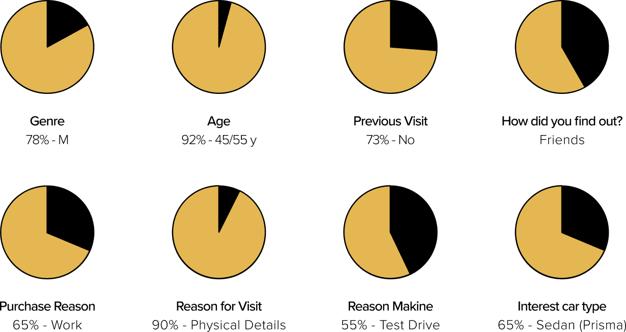
These results gave us an idea of the main needs, search points, and interests based on the product and helped us identify who we were targeting. These results gave us an idea of the main needs, search points, and interests based on the product and helped us identify who we were targeting.
Interviews and User Insights
The interviews were carried out with 7 internal collaborators of the dealership virtually. For this reason, the interviews only sought to obtain data on content and functionalities, understanding that perhaps there would not be 100% honesty, it was only intended to obtain general information related to clients or the industry and not in relation to the brand.

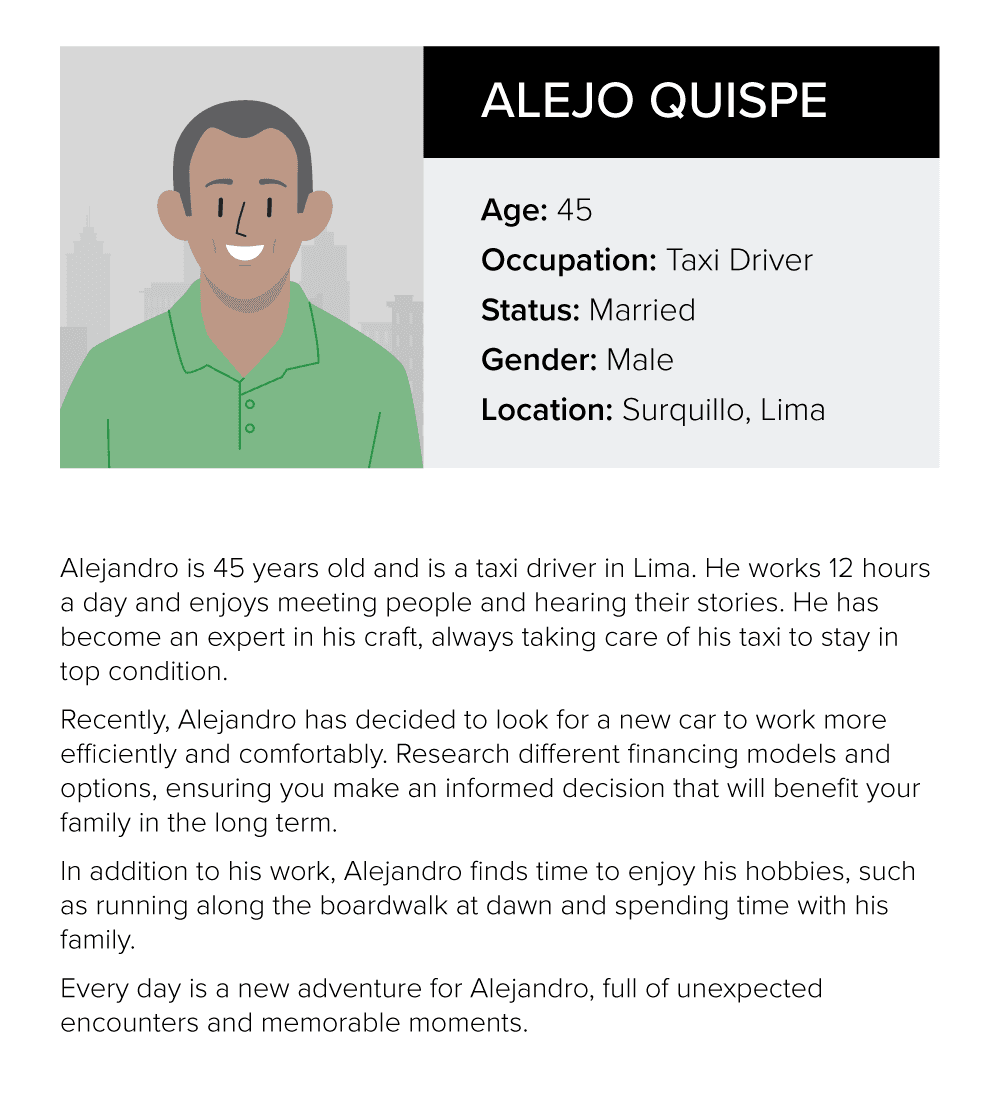
Most interested clients are taxi drivers (they have an agreement).
A customer makes more than 1 visit to the dealership before purchasing.
Whatsapp is the main means of communication.
The customer's main query is the price.

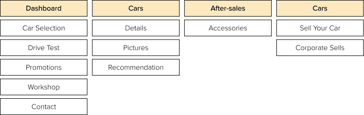
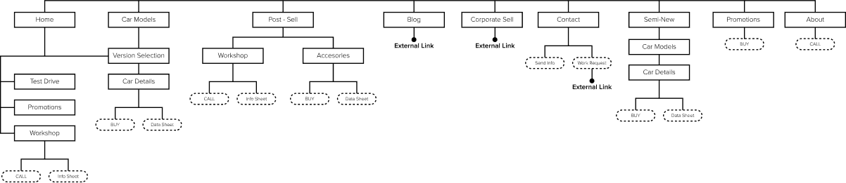
Info Structure
To be clearer about the content hierarchy, the services and characteristics that the client wanted to offer were separated, with this the general content was broken down and divided.
Activities were carried out within the dealership in which incentives were offered to interested visitors and customers in exchange for answering quick surveys and some questionnaires. The surveys were carried out to find out the user's feelings and motivations regarding direct purchases, reasons for visiting and to obtain suggestions for improvement.
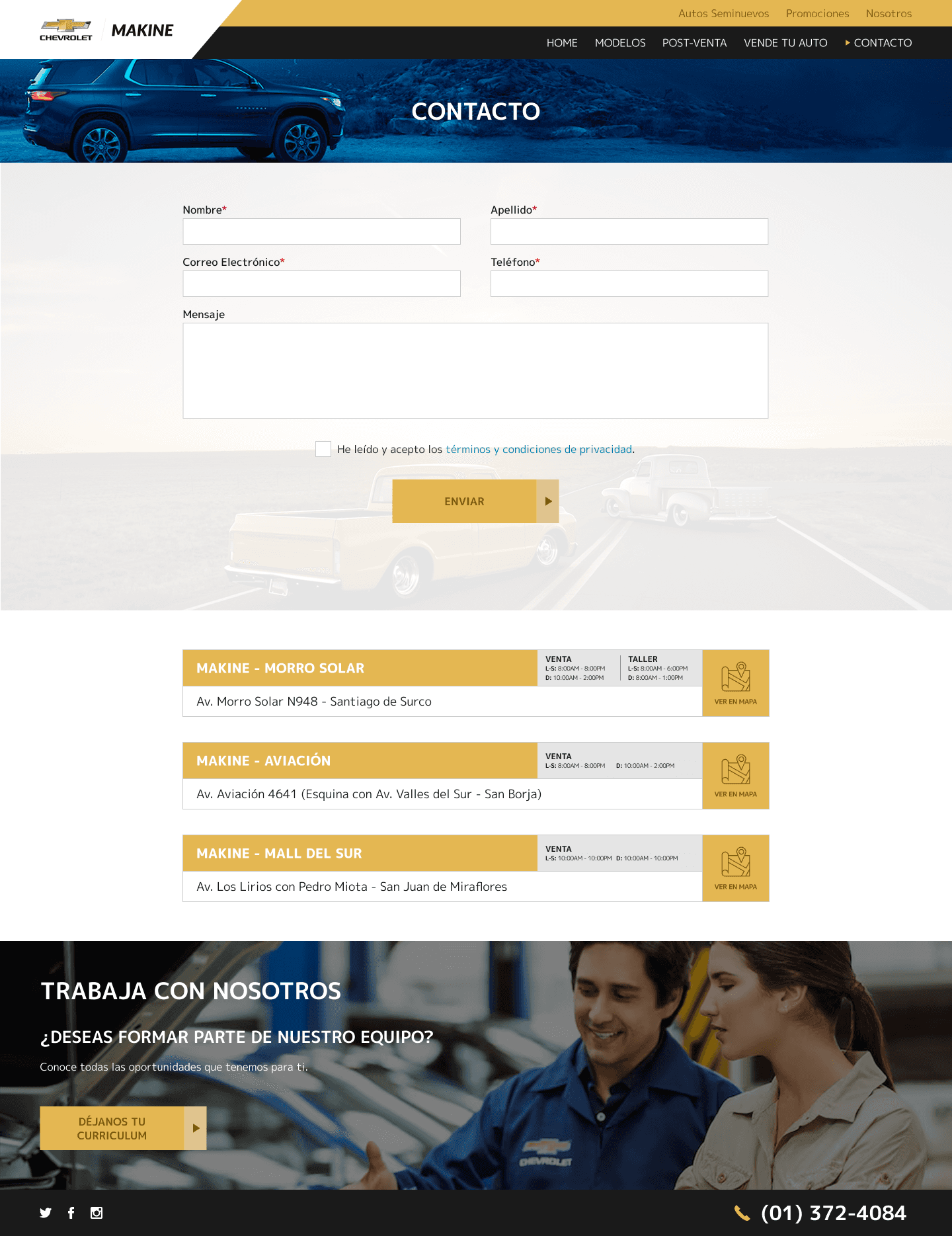
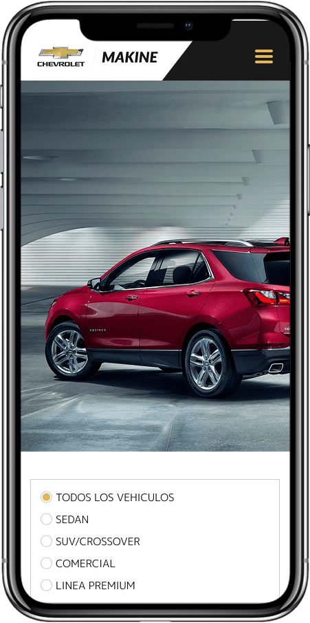
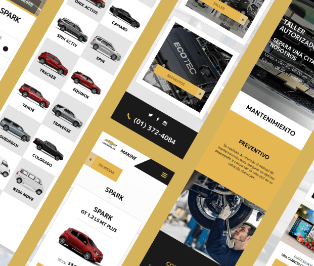
Diseño
The design was carried out considering the possibilities of Hubspot (CRM), so it was necessary to devise different solutions and options that adapt to the limitations of the platform.
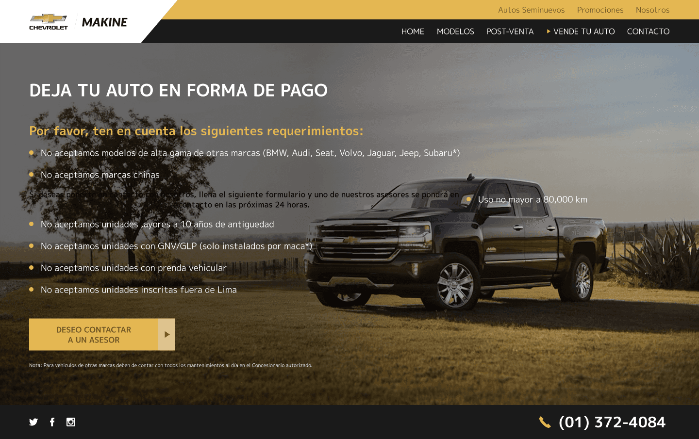
I maintained a flat design following the graphic guidelines specified in the brand book and following the client's instructions. Seek to obtain a clean and orderly aesthetic that would allow the user to find the content directly, always maintaining the modern tone characteristic of the industry.
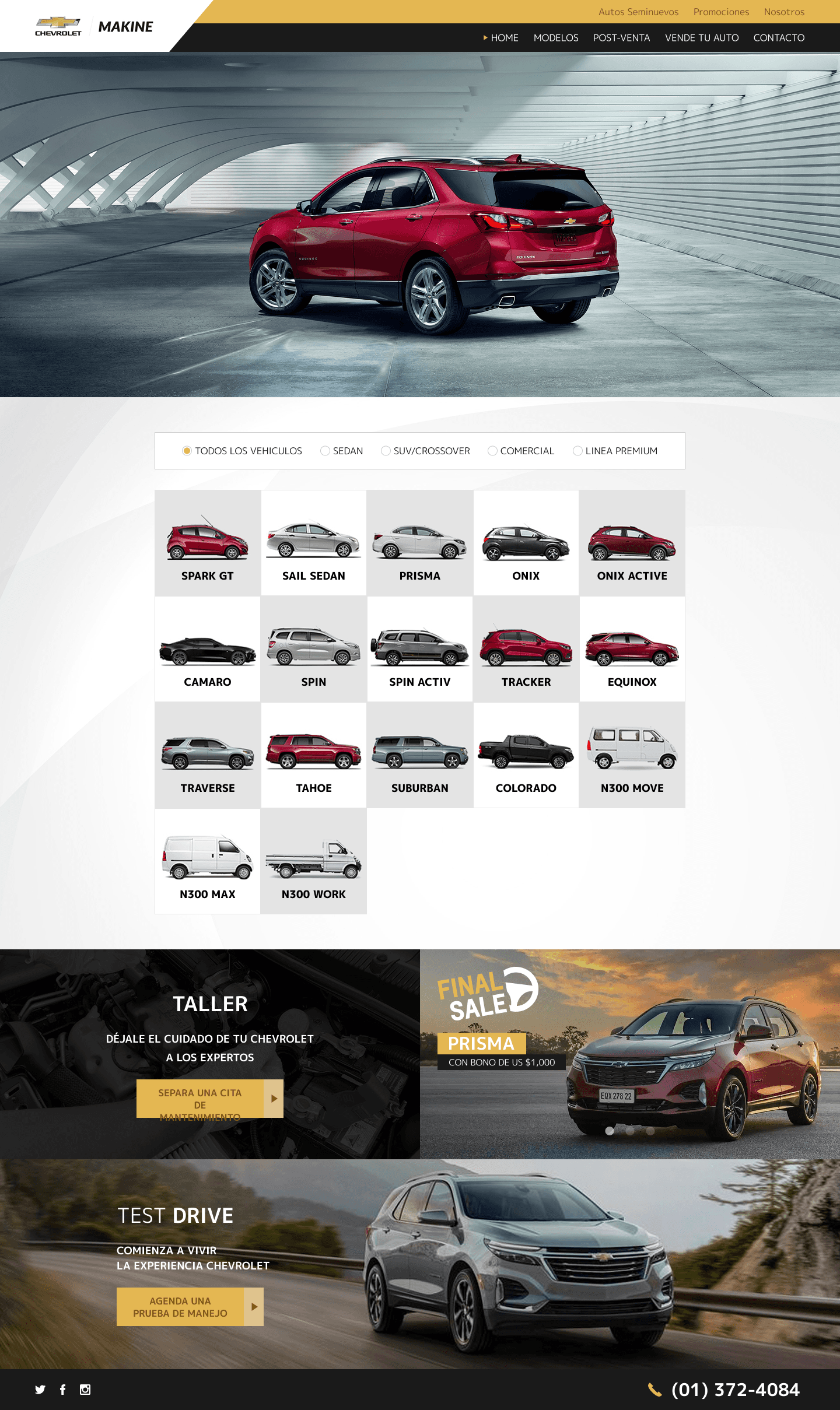


The first thing was to modify the components and items so that they could be approved by Hubspot, which is why the design always maintained square shapes without a radius and followed a visual structure based on sections and columns.
Interspersed the use of yellow and black colors mainly on buttons to differentiate access and interaction points. I also applied white as a base to generate contrast with the texts and product images and with this facilitate visibility and reading.


To achieve a more dynamic and organized design, the images were a visual resource applied to backgrounds and banners. They also served to separate sections.
I applied color filters on backgrounds to contrast items. Also used boxes and frames to give more variety of application in the design and to be able to organize specific content.
Proposed adding a Quick-action composed of 4 buttons to accompany the user throughout the navigation/purchase process, and providing quick access to the features most requested by the user. At the same time, I highlighted WhatsApp for immediate communication with customer service.