

CommnRoom
Client: Chevrolet - Makine
Role: UI/UX Designer
Year: 2018
Project Goals
Design the interface of an e-commerce website that allows the user to select, see the products in detail and be able to purchase them quickly and easily.
Research
The main objective of the research was: to understand user behavior in relation to the purchase of the product and information interests. I took advantage of the different possible means to obtain information from regular users and be able to define the target audience.
Most social apps focus on finding a partner and friends in general.
Are more inclined towards language learning.
There is no other similar apps in the country.
Have a defined visual design pattern.
Focus Group, Interview and User Insights
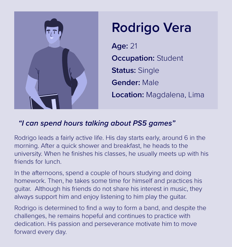
The client provided a list of 12 users (M/F 18-26 years old, university students) who were interviewed 1 on 1 to learn more about their interests, behavior, and consumer habits in general.
The interviewees were divided into two groups of 6 to obtain feedback about the concept of the product, and have a clearer idea of the utilities and possible functionalities. I focused a lot on understanding the main frustrations with apps of this type and how to avoid or correct these problems.

It is believed that there are bot profiles as users in the applications.
Insecurity due to possible exposure of information.
Social apps are related to adult material.
Video call option is not considered a necessary asset.
It is not a spending priority.
Study apps are related to language learning
Competitive Analysis
The competition was selected taking into account: functionalities, target audience, location, and the method of interaction between users. The competitive analysis was carried out to more clearly define direct competition and collect as much information as possible concerning content, service options, and use.
Thanks to this, it was found that our differential was “the possibility of filtering topics of specific interest” for users.


Features
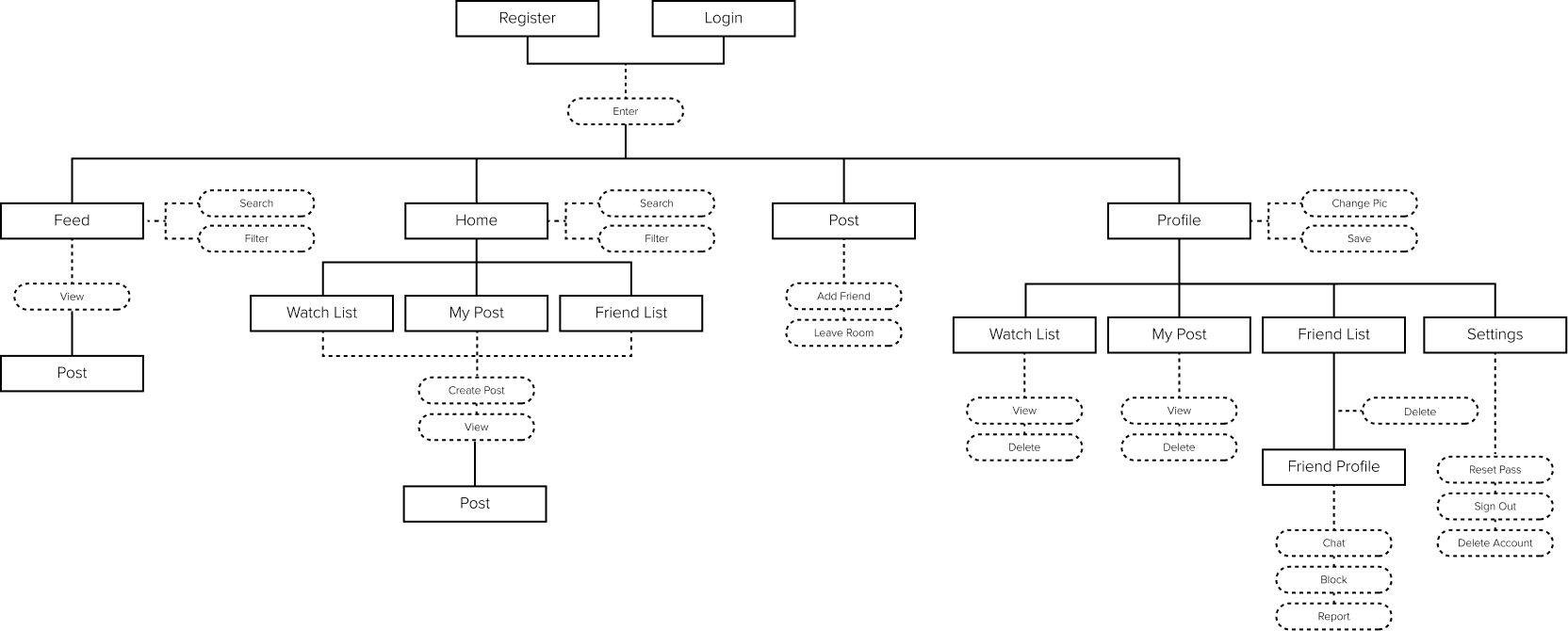
To obtain the features and funcionalities, I decided to use the needs and requirements of our interviewees as a reference. Since users were looking for simple and quick-to-use navigation, I tried to distribute the content directly and not add extra sections.
The user is looking for a place to learn, socialize and feel safe.
The product seeks to provide a dynamic space to meet and learn in a relaxed way.
Features
To obtain the features and funcionalities, I decided to use the needs and requirements of our interviewees as a reference. Since users were looking for simple and quick-to-use navigation, I tried to distribute the content directly and not add extra sections.

This activity also helped you understand the content hierarchy based on your tastes and preferences. From this, it was possible to rescue that:
Mistrust and information security are the most important factors for the user (there is a context).
It is perceived as a substitute for WhatsApp or Telegram.
There is no enthusiasm concerning skills and levels.
More features are accepted but the focus is on chat and room themes.
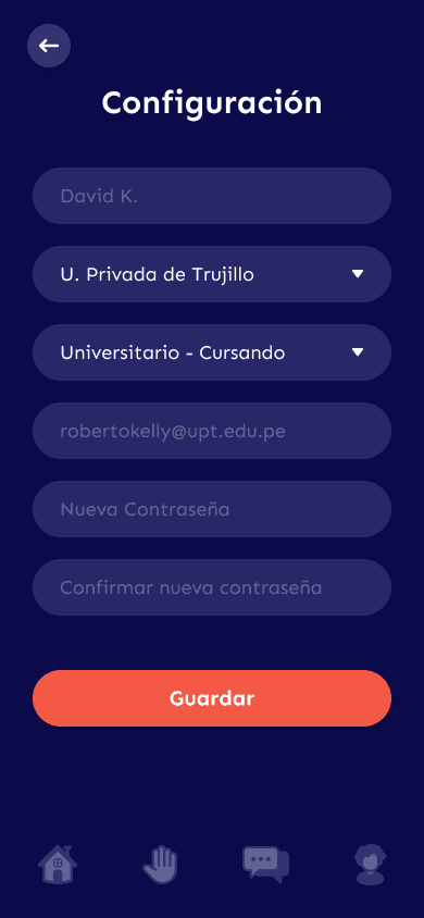
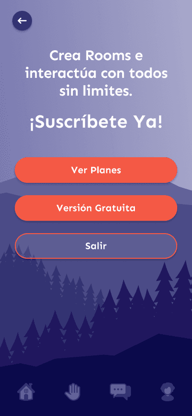
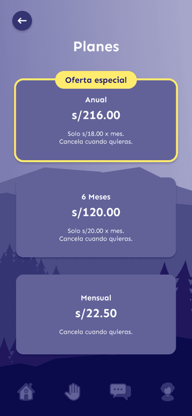
Design
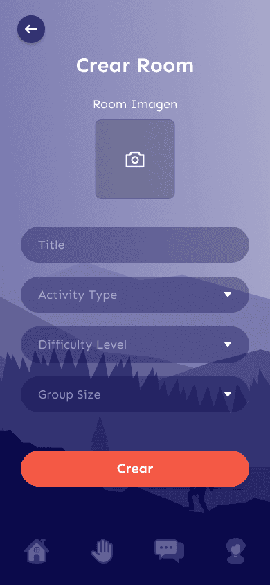
I decided to create a simple structure, focusing on reusing components and items and repeating sections, mainly due to time and budget issues. The aim was also for the user to have all the options at hand without the need to search for functionalities.
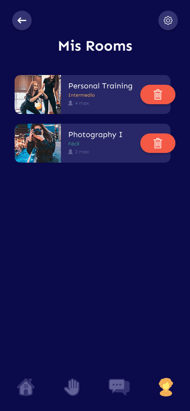
I made the design based on the client's suggestions. The aim was to obtain an aesthetic that projects tranquility and at the same time is jovial and differentiates itself from the traditional designs.


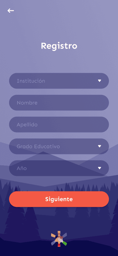

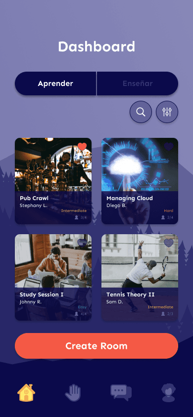

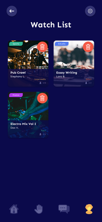
Used the backgrounds as the main means of decoration by applying themed colors in color and thus achieve a more established aesthetic and a more “football” tone.
The lack of legal and legal precautions (mandatory) served as a resource to gain more space due to the little visual content.


I relied a lot on the use of more stylized icons as a resource to achieve the desired style and give it a more playful touch. These would facilitate understanding and accompany reading.
The structure was mostly made up of boxes, card and fields, which made it easier to position items. I was asked to stay away from square shapes so I applied radius to most of the components and transparencies to differentiate them from the background.

Used the backgrounds as the main means of decoration by applying themed colors in color and thus achieve a more established aesthetic and a more “football” tone.
The lack of legal and legal precautions (mandatory) served as a resource to gain more space due to the little visual content.


Used the backgrounds as the main means of decoration by applying themed colors in color and thus achieve a more established aesthetic and a more “football” tone.
The lack of legal and legal precautions (mandatory) served as a resource to gain more space due to the little visual content.
Used the backgrounds as the main means of decoration by applying themed colors in color and thus achieve a more established aesthetic and a more “football” tone.
The lack of legal and legal precautions (mandatory) served as a resource to gain more space due to the little visual content.