

USIL Corp
Client: Corporación USIL
Role: UI/UX Designer
Year: 2018
Project Goals
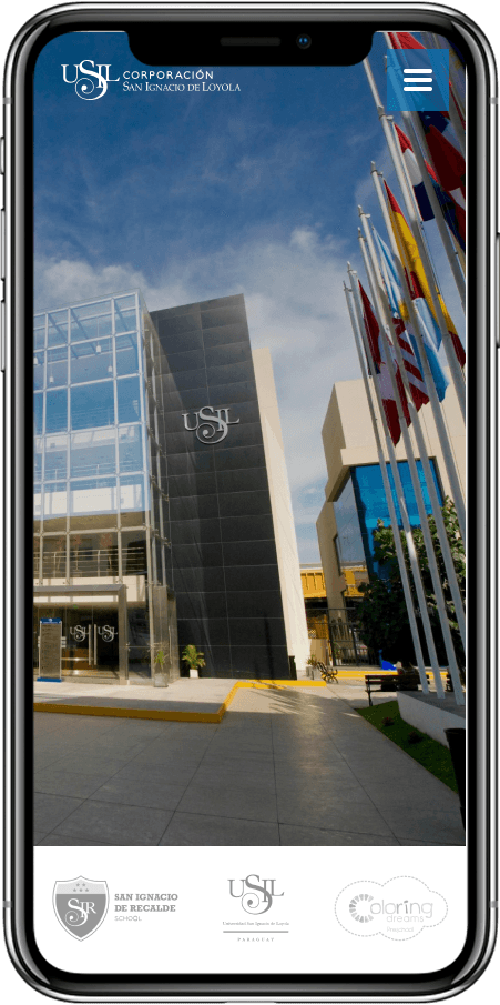
The main objective was to create a responsive website that would generate brand presence and serve as the information hub for the corporation. It would highlight the ownership of the sub-brands and allow targeted users to find direct information about the brand and its activities.
Research
For the research, we focused on the main problem raised by the client: brand ownership and user information requirements.
Online Interviews with users.
Desk Research
Interviews and User Insights
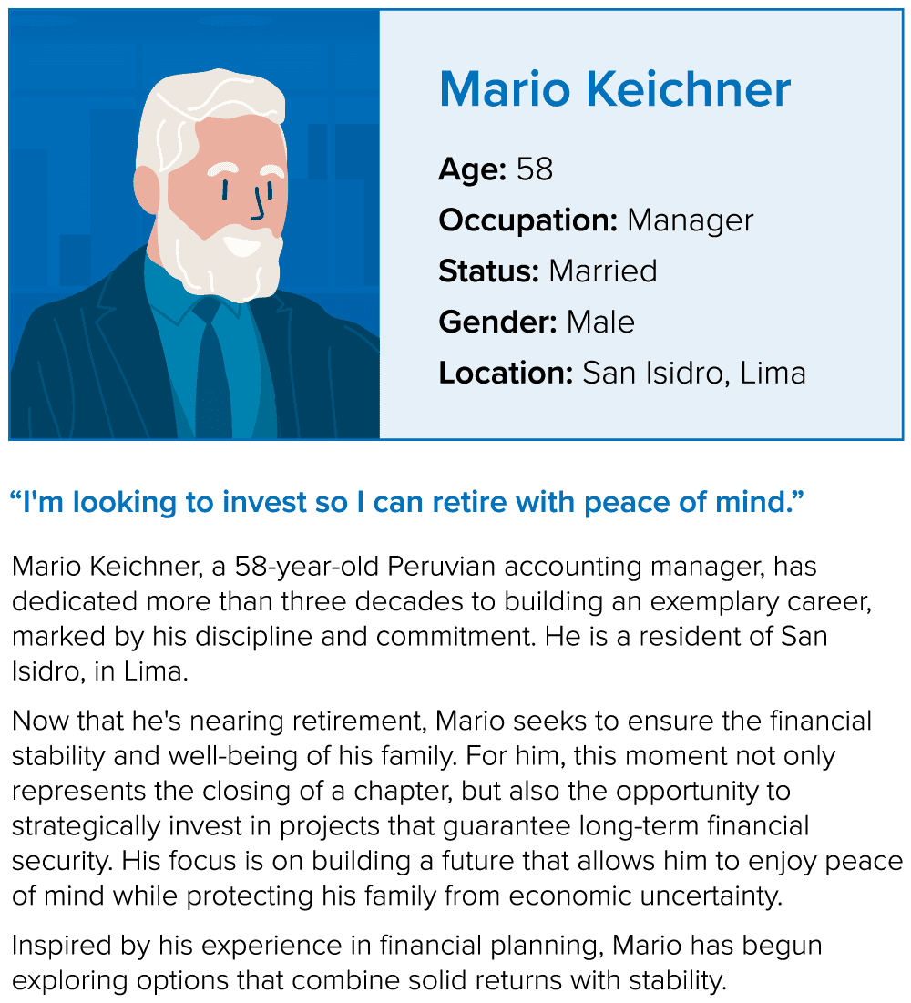
8 one-on-one interviews were conducted with employees from five different companies (investors/department heads, men and women, 50-60 years old) via Zoom. The interviews sought to understand users' main interests and information needs, as well as their online behavior.

They mostly use computers as their primary means of online browsing.
Users have already acquired trust in the brand.
There is significant interest in the company's infrastructure, activities, and actions.
The main reason for potential investment is family and future economic stability.

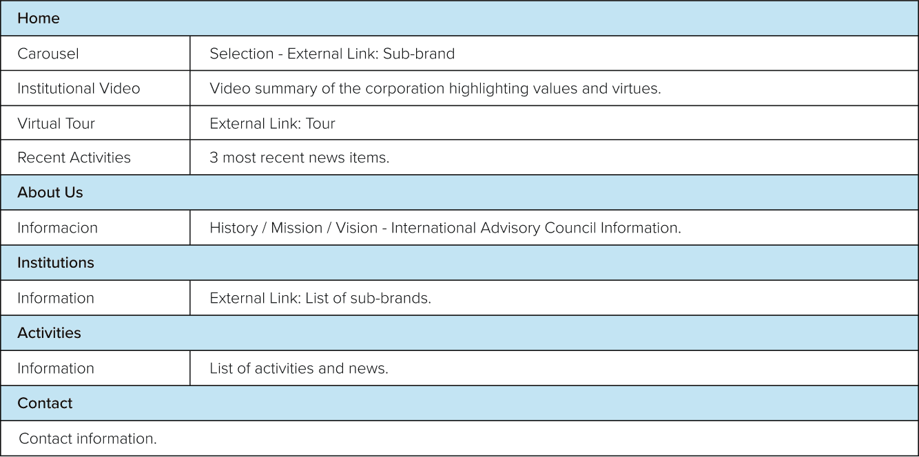
Info Structure
The content structure was defined taking into account the main needs and requirements proposed by the target audience and research results. This was intended to distribute the information and organize it according to the requirements and priorities of both the user and the client. It also helped define the navigation flow.

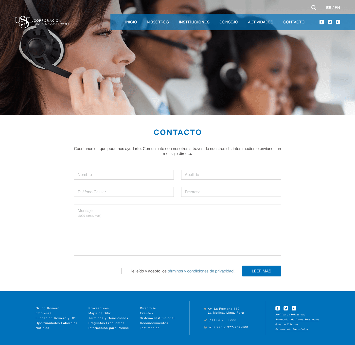
Diseño
Para el diseño se tuvo que tomar en cuenta las limitaciones en Hubspot por lo que fue necesario adaptar las ideas a las posibilidades de la aplicacion.
El diseño se realizo siguiendo los lineamientos graficos especificados en sistema de diseño de la marca. Se usó todo el material proporcionado por el cliente y mantuve una constante comunicacion con el equipo encargado lo que permitio llegar a las fechas marcadas y conseguir el resultado deseado mas rapido.


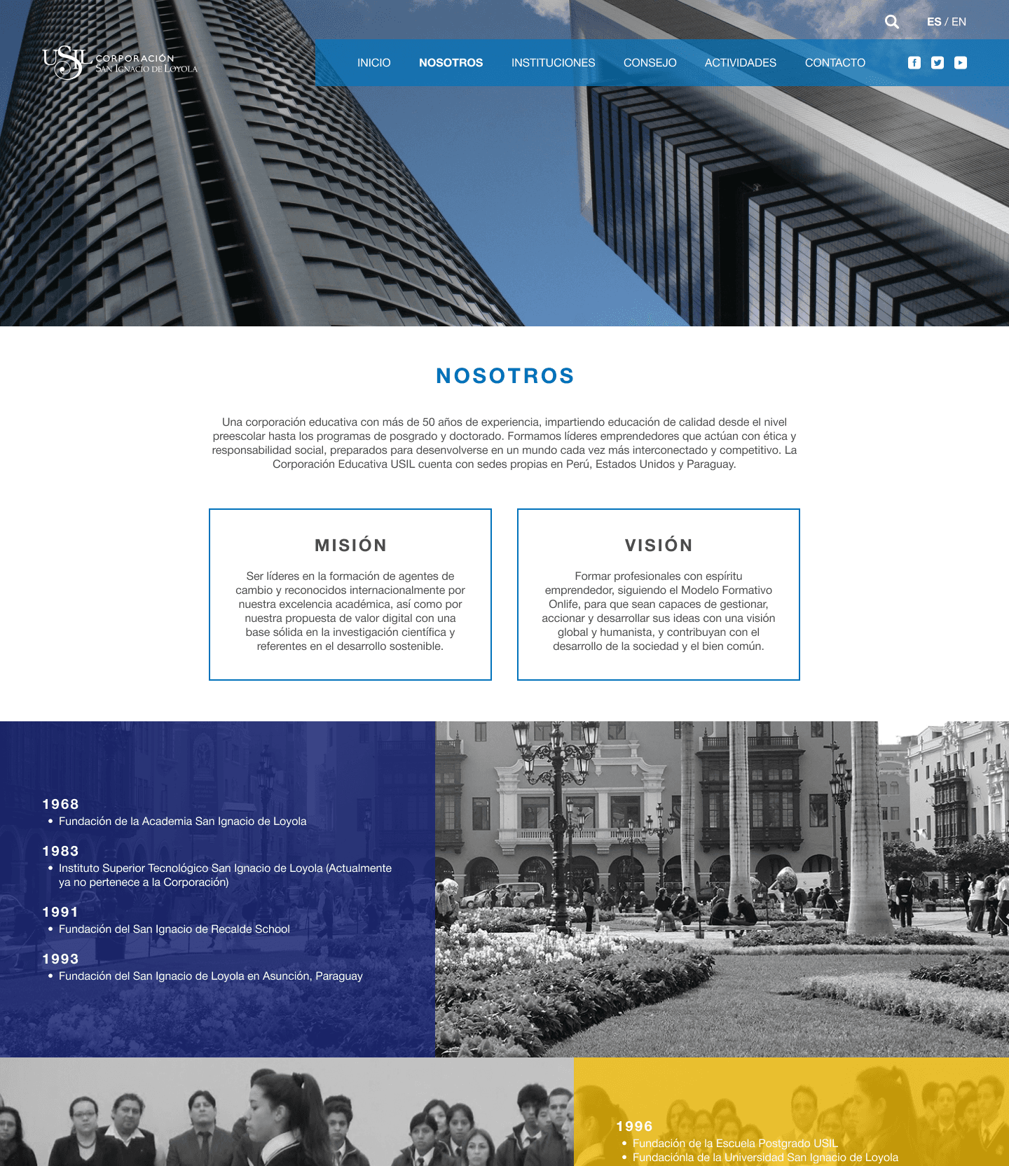
El diseño se realizo siguiendo los lineamientos graficos especificados en sistema de diseño de la marca. Se usó todo el material proporcionado por el cliente y mantuve una constante comunicacion con el equipo encargado lo que permitio llegar a las fechas marcadas y conseguir el resultado deseado mas rapido.

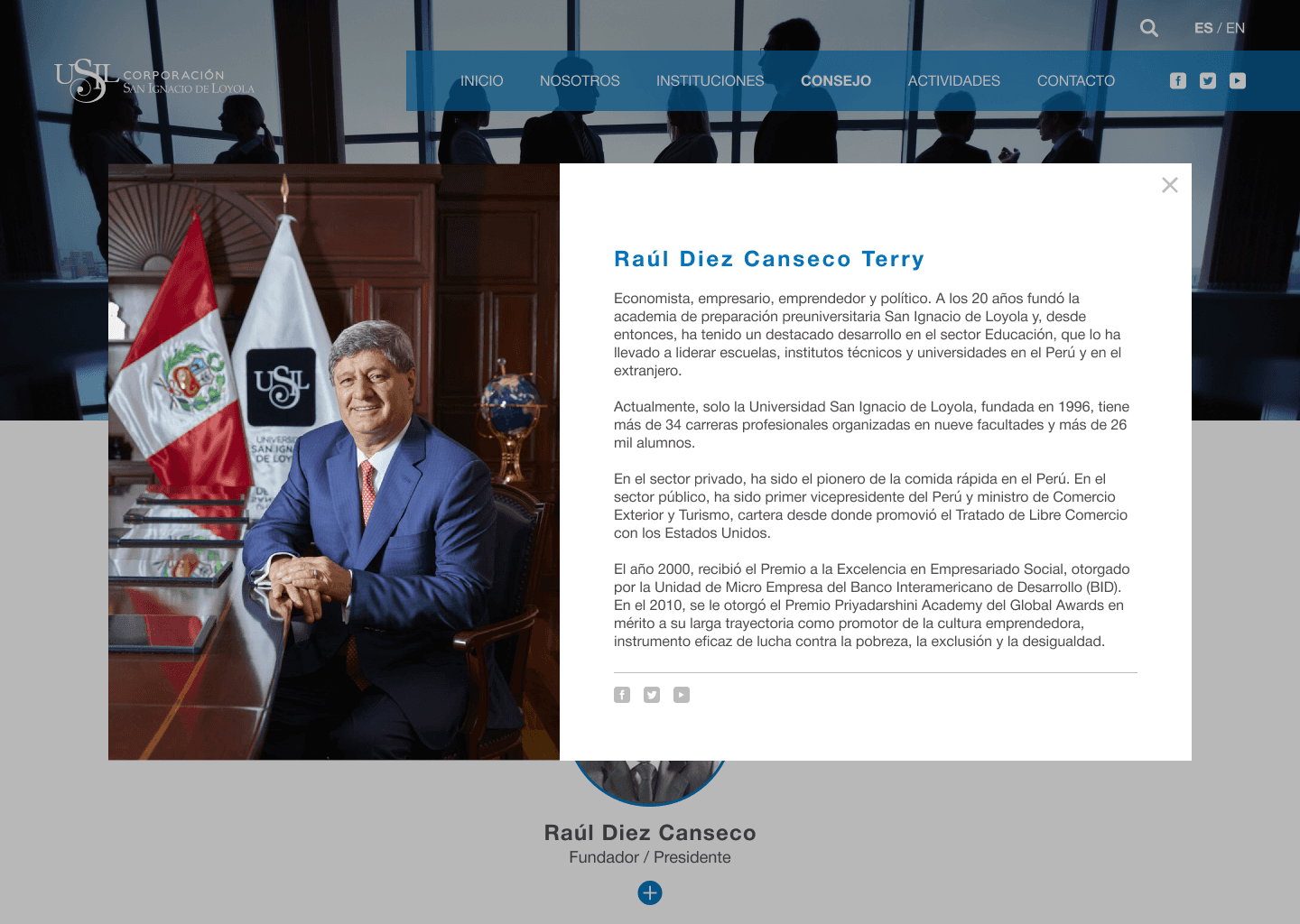
The use of icons was applied in specific cases to avoid saturating text and to accompany reading. Finally, I tried to give each section its own appearance, taking advantage of the different possible spaces and the informative content.