

Solution Telemed
Client: Chevrolet - Makine
Role: UI/UX Designer
Year: 2018
Project Goals
Design the interface of an e-commerce website that allows the user to select, see the products in detail and be able to purchase them quickly and easily.
Research
The main objective of the research was: to understand user behavior in relation to the purchase of the product and information interests. I took advantage of the different possible means to obtain information from regular users and be able to define the target audience.
Competitive Analysis
The competition was selected taking into account: functionalities, target audience, location, and the method of interaction between users. The competitive analysis was carried out to more clearly define direct competition and collect as much information as possible concerning content, service options, and use.
Thanks to this, it was found that our differential was “the possibility of filtering topics of specific interest” for users.

Interviews & User Insights
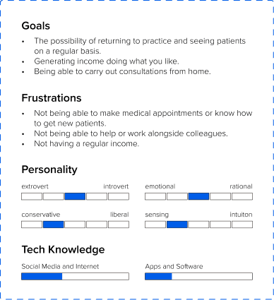
I conducted 12 one-on-one interviews with the two types of users (7 patients and 5 health professionals). The objective was to understand their motivations for use, service needs, frustrations, and possible functionalities for the user. It was found that:
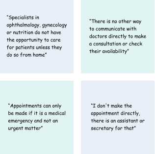
Appointments are made through an external platform.
Communication and delivery of documents between users is mainly done via WhatsApp.
The registration and appointment scheduling processes are annoying and very long.
COVID-related services are prioritized, leaving aside other specialties.
No availability of schedules or doctors.
There are no options for direct prior communication between doctor and patient.


Defining Insights
To obtain the features and funcionalities, I decided to use the needs and requirements of our interviewees as a reference. Since users were looking for simple and quick-to-use navigation, I tried to distribute the content directly and not add extra sections.
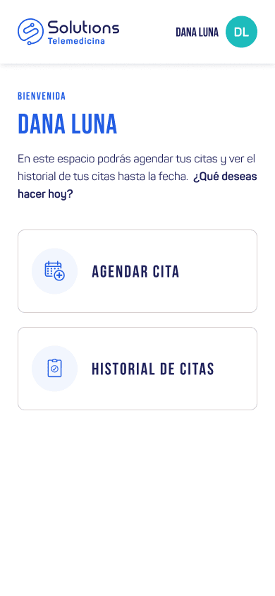
Patient needs to resolve doubts and receive medical attention quickly and efficiently without leaving home.
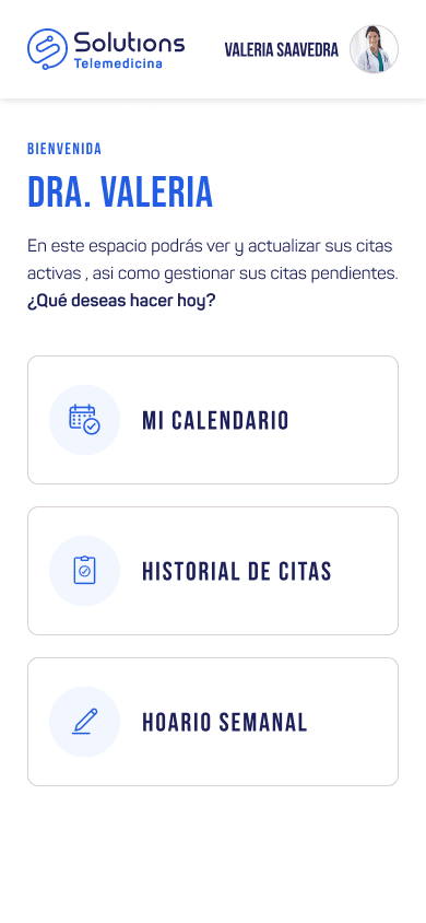
The doctor needs to offer services to generate income by seeing and resolving patients' questions.
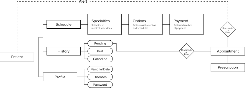
Card Sorting
I conducted 12 one-on-one interviews with the two types of users (7 patients and 5 health professionals). The objective was to understand their motivations for use, service needs, frustrations, and possible functionalities for the user. It was found that:

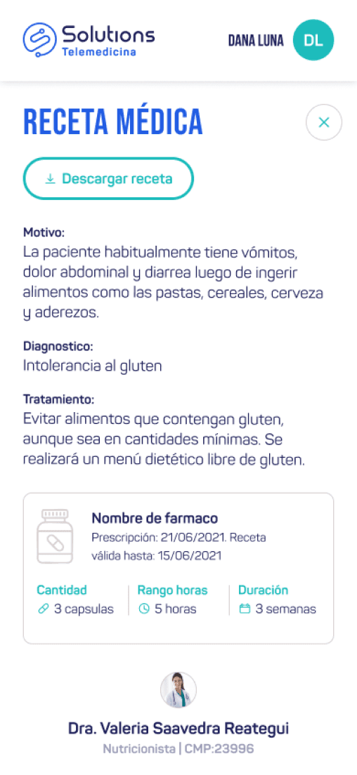
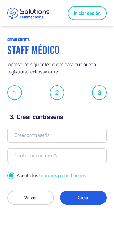
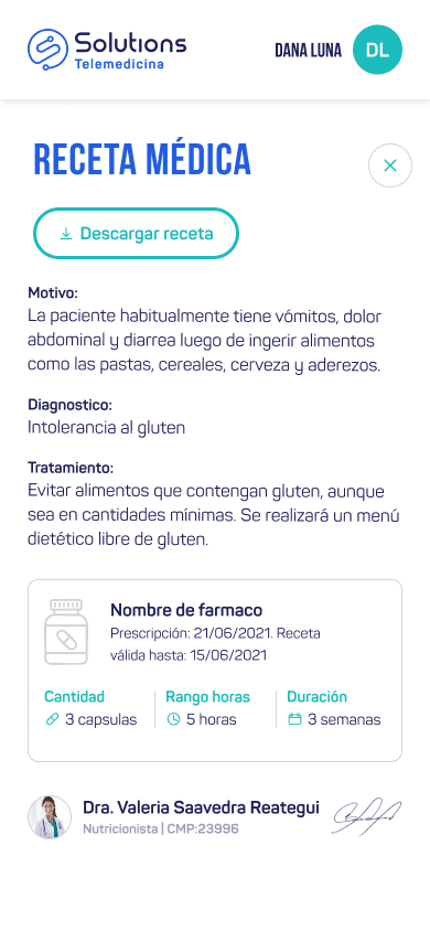
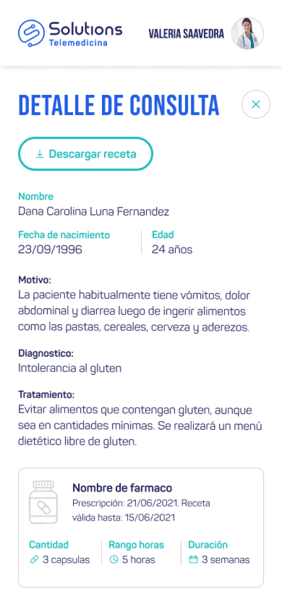
Possibility of generating and delivering/receiving a prescription in PDF format.
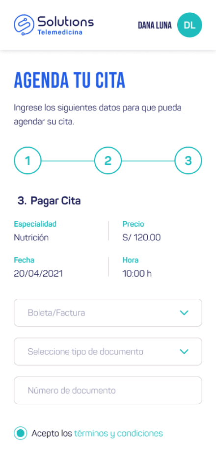
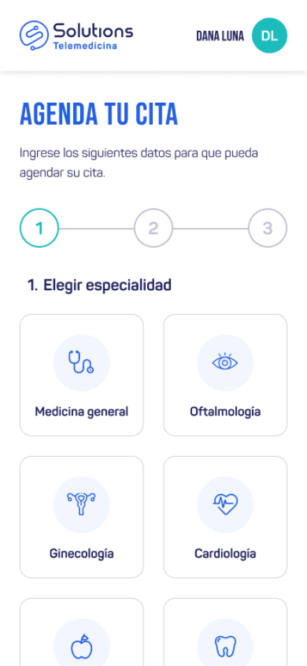
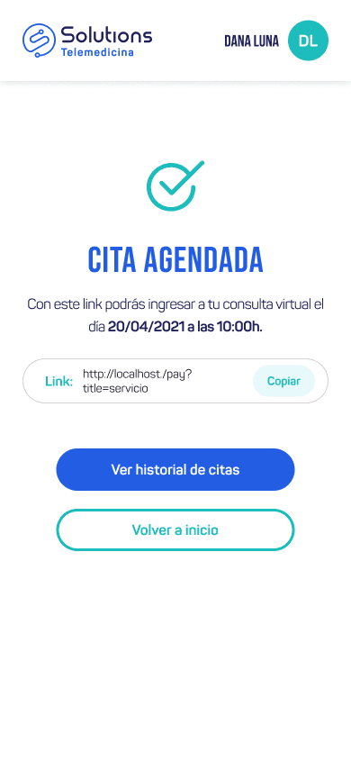
It was agreed that the most important thing is to be able to schedule and have a virtual consultation.
High level of indecision among participants in relation to costs and insurance.
Its important that specialties offered are those that are not available to the public due to current situation.
Features
To obtain the features and funcionalities, I decided to use the needs and requirements of our interviewees as a reference. Since users were looking for simple and quick-to-use navigation, I tried to distribute the content directly and not add extra sections.


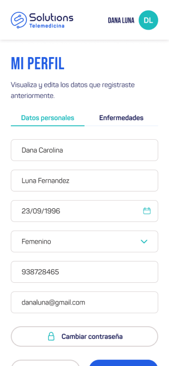
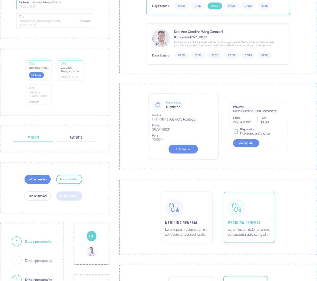
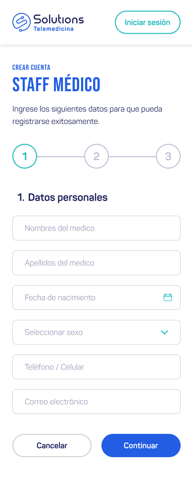
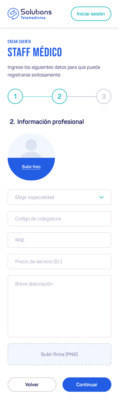
Design
I decided to create a simple structure, focusing on reusing components and items and repeating sections, mainly due to time and budget issues. The aim was also for the user to have all the options at hand without the need to search for functionalities.
I made the design based on the client's suggestions. The aim was to obtain an aesthetic that projects tranquility and at the same time is jovial and differentiates itself from the traditional designs.


Used the backgrounds as the main means of decoration by applying themed colors in color and thus achieve a more established aesthetic and a more “football” tone.
The lack of legal and legal precautions (mandatory) served as a resource to gain more space due to the little visual content.
Used the backgrounds as the main means of decoration by applying themed colors in color and thus achieve a more established aesthetic and a more “football” tone.
The lack of legal and legal precautions (mandatory) served as a resource to gain more space due to the little visual content.


Components were mainly composed of simple shapes, such as rectangles, squares, and circles. This made it easier to organize elements and components when designing.
Finally, the design of iconography helped a lot to facilitate reading and generate a more playful and modern image.
Used the backgrounds as the main means of decoration by applying themed colors in color and thus achieve a more established aesthetic and a more “football” tone.
The lack of legal and legal precautions (mandatory) served as a resource to gain more space due to the little visual content.


Used the backgrounds as the main means of decoration by applying themed colors in color and thus achieve a more established aesthetic and a more “football” tone.
The lack of legal and legal precautions (mandatory) served as a resource to gain more space due to the little visual content.
Used the backgrounds as the main means of decoration by applying themed colors in color and thus achieve a more established aesthetic and a more “football” tone.
The lack of legal and legal precautions (mandatory) served as a resource to gain more space due to the little visual content.